Saturday, 19 February 2011

Finished Concepts

I have designed and finished my final vehicle concepts. After finishing the background i was able to slowly work on the design of the vehicle in the environment and placing it within the golden section of the image.

Final concept:


while drawing this image i had to remember some basic rules of lighting. As my vehicle is outside and is is in an ambient light sauce so most of the vehicle will be lit up there are some slight fading from parts that are faced away from the light point of the light sauce. Other aspects i had to conceder were focus and distance, because my vehicle is in a scene and environment distance and perpective would have to be used, thanks to a photography session earlier in the term i understand how that because our main focus is in the foreground that the background would have some light blur.

I wanted to make the vehicle appear more in the image than just placed into the scene so i added dirt spray from the tires like it would be moving through a dusty rocky plane. Makes the image more realistic and makes the vehicle seem that it might work more and helps create the scene.

Because we have to show our vehicle in more than one weather condition i created some overlays to show it in both rain and snow.


Tuesday, 8 February 2011

Enviroment

I have created a basic image of my enviroment not keeping to detail, by blocking colours and creating basic lines of shape i can keep the focus on the vehicle more than the enviroment. Also as it would be blurred it wont make to much difference. I allowed space to show sky to add to the scene.

This is my background for my final piece:


Taking intrest into the work we did on compistion i have created a point in which the visiul look would be improved using the method of the gold point. At this point ill place the center and focus of the concept vehicle.

Final piece

For my final piece i will have to choose one of my concepts and show it in a finalize version in a enviroment. This first means that i will have to choose what vehicle i will use and why. Its hard as all the concepts would work in my game and they were recreated for that reason. But by looking at the concepts in a more constructive way i can see that one vehicle stands out above the rest.

Out of my 3 vehicle concepts i feel my best is my three wheeled offroad vehicle because it is unsusal and purpose based. As the other concepts are crafts and are polietable they both feel simular and would work simular to most planes in any game dispite. My fighter jet also to me looks simiar to the racer vehicles in the popular game series Wipeout. I dont want to re create a vehicle but show a new design. My other pod design seems to be lacking feel and sence to it as the design is simple and very blockly. By choosing the 3 wheeled vehicle and i can show it in different enviroments on land and make it feel more apart of my story world. The style and look in how it was created fits the style of the game as its futuristic but still fits the metal and solid built of human technology.

To start my final piece i had to create a background to then draw my vehicle into. taking in mind both perpective and compsition i want to place my vehicle in the lower golden spot of the image to create a better image overall while showing the vehicle in a perpective. The enviroment of the story is on more of a barron planet meaning rocky and dirty, this has given me the idea of creating a mountainous scene with my vehicle in the forground to show depth as the mountain would be smaller and far back in the distance. This would also allow me to explore depth of vison and focus the main view onto the vehicle more than the enviroment itself. Remembering to make the enviroment more realistic i feel that when placed into the enviroment taking point into if the vehicle is moving is key as it would create a different effect on the enviroment and the image.

Sunday, 30 January 2011

Pod Transporter


This is my next design is a small one man Pod that is faster than walking but is mainly used as a armour vehicle. The idea behind this vehicle again was to be for enemies to attack and chase the player. This vehicle as connections to like a police car as it would be used for A.I to chase and capture the player. This means there is no weapons attached to this vehicle but it is well armoured and quick. Its not the most manoverable vehicle and has a open back entrance.

To enter the vehicle you would get in from the back as it would be open and then the player would be standing polieting the vehicle. It would be most vulnerable from the back as the player would be visible. The wings like the other design come to a point to appear bad and evil.

Shuttle Design


i have been working on a design for a small ariel fighter after i could see the shape of one in one my thumbnail designs. I took the same view and added more detail and some color. The simple design made the vehicle easy to design the other angles of the ship. I designed the 3 other angles of the ship to give a overall view of the craft, I also changed the main colour to see how it would look for other crafts and using color and a main example of different enemies or factions in the game. Red appeared to make the craft bad and primarily used by enemies which was the plan, the sharp spike like front and side wings also connate the enemy appearance.

I did two other designs i did were using the the already designed fighter i just added some weapons to the craft. These could be different crafts in the game meaning stronger enemies and the appearance of more drivable vehicles. The first design was of rockets attached to the side hull to the craft as then it would become a more aggressive and damaging attack vehicle. The other was a of a small machine gun that would come out of the bottom nose of the craft as its in flight.

I had some more ideas that envolved a turret at the back of the vehicle that could be used by another player to shoot down enemies from behind but as i want to make this a basic enemy craft giving it to much fire power from all over will make it unbalanced as a basic craft.

The craft would work mostly on thrust and glide with the lack of wings. The thrust would be generated by oxygen being enigted as it travels through the fans and engines on the side of the craft. Entering the craft is like most modern craft today with the re-enforced glass cockpit would open up and slide back to allow people to enter. This craft can only fit one player. It would have a low health as its small and lacks armour.

Tuesday, 25 January 2011

Lighting

We had a brief study in lighting last week looking at how light moves and how to use light in our images and work. The main point was to understand the principles of light and understand the main terms. Like the last task we had to find some examples of art and then analyse the work with our new knowledge.


This first piece of art i have found as a good amount a light in the image to begin with allowing me to be able to discuss it more. Firstly the direction of the light is from a point source e.g sunlight, making it more realistic, we can tell this by how the light has more bounce around the room of the image and there isn't doesn't focus on a spot on the wall but the whole wall. The occlusion on the wall shows the lack of light in that direction and the fading out of bounce light. The character shows a lot of bounce light as the skirt has many creases but the light bouncing from all over is lighting up the creases enough. Some are almost black as they are well folded over allowing no light and some are well out of the direction of light and most bounce isn't getting around. Her neck is also a good area to see bounce light in action as the head would block out the light but the back side of her neck is still fairly light as there is plenty of light as its most likely bouncing from the wall behind. This image works as you get a lot of light being bounced but the artist has understood the direction of the light and were areas would have shadows but calculated the amount of bounce that might hit that shadowed area.


This piece from Da Vinci shows a good understanding of Spot Lighting as the characters are strongly highlighted from a above source that is very strong. You can tell that this light doesn't come from the sun as he has included windows in the background that show the light is coming at a different angles highlighting the edges of the windows. This light seems to have no affect on the characters as the light isn't hitting the back of the woman highlighting her back edge. This also suggests the sun is directly behind and in-between the two windows as the light is entering them both at two different angles going out from each other. Bounce again is in this image best seen on the babies body. As the body is down and in towards the mother that means the direction light would mostly leave the light blocked out but most part of the body visible meaning bounce back light from the mother and other areas are effecting the image and Da Vinci has taken this into mind.


The light of reflection as been taken into account as the artist has looked how the light is being reflected off the waters surface and into our eyes. As the image is entering the water and then getting reflected some of the image is lost as well as the light is reflecting of a moving liquid allowing light to be lost while reflecting in a different direction. If you focus on the boat you can see that the boat has a blue side which means that the light is reflecting from the water to the boat giving it a blue look.

Wednesday, 19 January 2011

Composition

To help improve our art and talents we attended a lesson in composition to help us understand how can make our images better without changing the idea just placing the scene different. Composition is how elements or objects are objects are arranged in photography, art or sculptures. By bringing different compositions into a piece of art you can change the dynamic look of the piece and make it more visually interesting making more out of a single piece of work.

Our focus was on understanding the rules of composition and how they effect the visual look of art. We first learn the rule of the golden point. The golden point is the spot that the eye finds most comfortable, this point welcomes the main focus of a piece of art as the eye will always go to this point. By placing a main piece on the point will mean the area of your art that you feel needs to have the most focus should situate on that point.

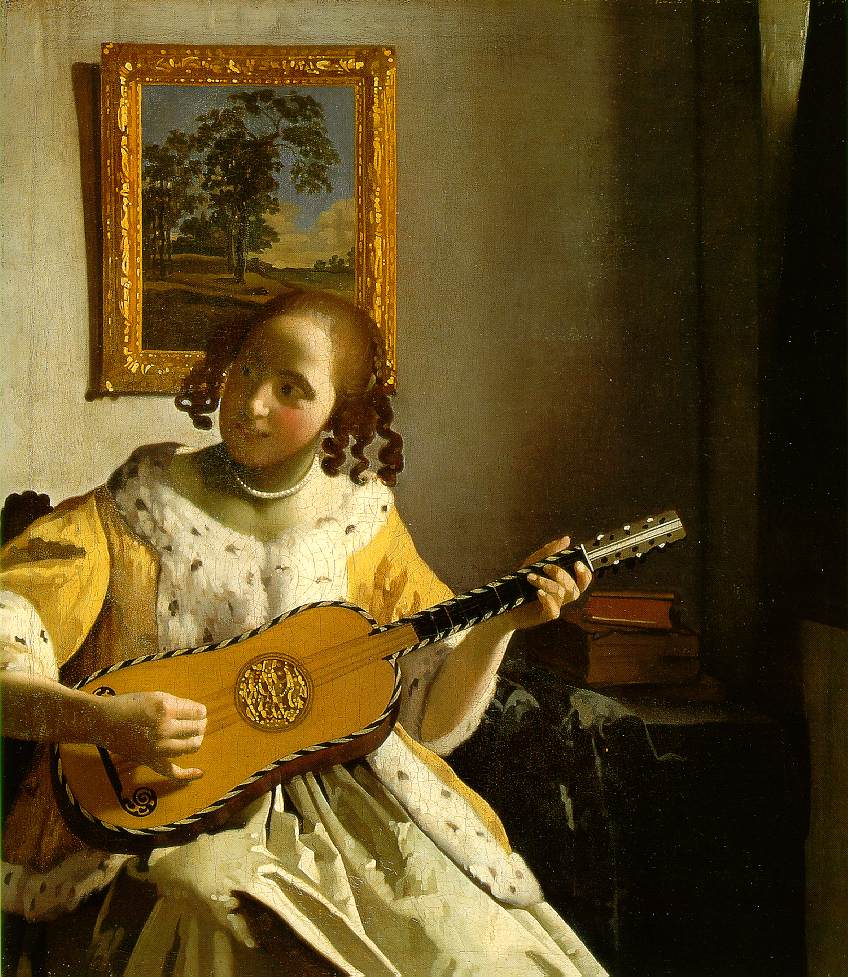
We were asked to find images to analysis using the different methods so I'm going to use this painting done by Leonardo Da Vinci to helo show the different rules of composition, Leonardo Da Vinci was a very skilful artist, his work is very detailed and perfect but what you don't see is the composition he was able to place in his art. This one piece i fell could have more than one style of composition within which wouldn't be surprising for a artist of his talent.

His work example:

The golden point can be found using a cross over of lines. These lines are made from squaring a piece of the medium used and having a imaginary line come across to show the square, a line would go from from one end of the whole medium to the other and another would come across from the other end of the smaller rectangle of the medium to the opposite corner of the first edge of the square made


This is what it would look like with the lines visible, the small triangle formed were the lines meet is the golden area but the cross over is the golden point, this is were the eye find it easier to look at. In this picture you can see how this characters hand falls perfectly into place, suggesting this was done on purpose for us to have a look at his hand in that position because if not it would be there for not much of a reason. This point leads me to question the art itself like why is he like that and why does the artist want me to view that point meaning i have already ingaged myself into the image.

The Rule of Thirds is a series of line that break an image into 9 squares, this gives 4 crossovers of lines, these again are the golden points of the rule of thirds meaning that if you want to make a image more dynamic getting this points fitting with the image will change the art in a more positive aspect.


Again this image follows the rules of thirds to me as the points fit onto different aspects of the character meaning that these points are making our eyes too see what the artist wants us to focus on. I felt this works well with this image because it leads my eyes from the face down to the arm, around to the elbow and up perfectly to his thumb and hand. It cant be by accident that two rules both fit the image perfectly at a very similar point on the hand meaning that he has thought this image out thoroughly.

Now the Rule of L is simple as an art piece will have a main point of intrest and the rest is background space or other things happening. On a image an L can be used to create a smaller area of focus. Again with the same image we can see the result.


Now again the character fits perfectly into a smaller area and that his arm follows these lines soo closely. The inner area L shape created does hold art and visual imagery but you can see how its not as relevant as the main part and it also is dull and dark and more of background than anything else. What its doing it focusing you to a area and then forgetting another so that area can be duller or less defined but still the image looks great. I like how in this example again the arm follows the lines so closely with the L holding small irrelevant piece of clothes and just blackness of the background.

'L' shape doesn't have to be in one area it can rotated around the medium and there can even be 'L's' inside 'L's' if you want to show more in one image but want to seportrate the picture out but keeping the image dynamic. This image was created Feng Zhu


He has spaceships that have a strong L shape feel about them and a lot going on in one image, so using these method allows you to get a good focus on each area separate but still a good unstanding of the image as a whole. I also feel that it helps with depth and the smaller the L the more your drawn into the image and it helps with the distance shown in his work.

Another image i have found that uses the 'L shape' composition is this comic book cover :


This image is using two 'L' shapes to create three boxes on the image to bring you into the image. The first its focusing you on the title of the comic which is important as brings you to remember the name and if u are a reader of this magazine then u will automatically see it, it would next would bring you down to view the background. The next section and helped shaped the characters body pose and allows you eye to follow him smoothly down the page. The final box again shows details of the background and faces but also more importantly leads you to the names of the creators making them more likely to get noticed. Meaning this way has made this page more beneficial for more than one reason.